

Social media posts compare a German TV program’s weather maps from 2017 and 2022 to claim it now uses more vivid colors to exaggerate heat and the effects of climate change. This is misleading; the channel said it adopted a more accessible format that uses color, not just numbers, to reflect daily temperatures.
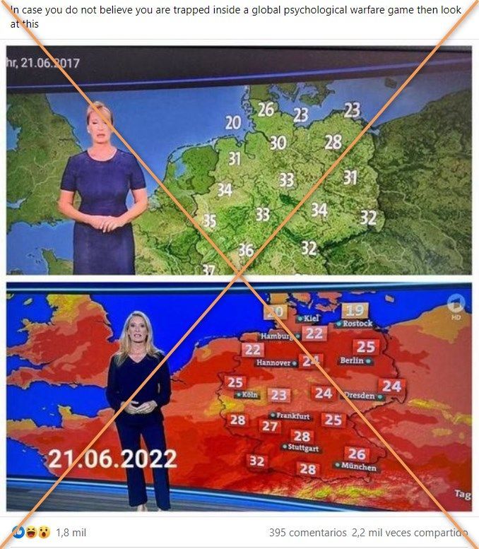
“In case you do not believe you are trapped inside a global psychological warfare game then look at this,” says a Facebook post published July 22, 2022 by Jovan Hutton Pulitzer, an inventor who has previously promoted misinformation about US elections.
The post, shared more than 2,000 times, includes two pictures of maps from German weather news reports.
The first map, colored green, is dated June 21, 2017 and shows temperatures between 20 and 37 degrees Celsius (68 and 98.6 degrees Fahrenheit). The second, colored red, is labeled June 21, 2022 with temperatures between 19 and 32C (66.2 and 89.6F).
 Screenshot of a Facebook post taken August 2, 2022
Similar posts circulated widely in other languages, including Spanish, Portuguese, Romanian, Croatian, Finnish and Slovak, during the June and July 2022 heatwave in Europe.
Maps are genuine
Using the logo in the pictures, AFP traced the weather maps to the Tagesthemen daily news magazine produced by ARD, a joint organization of Germany’s regional public-service broadcasters.
The green map stems from a June 21, 2017 weather report presented by Claudia Kleinert.
Kleinert reported temperatures between 20 and 28C in northern Germany and 33 to 38C in the west and southwest.
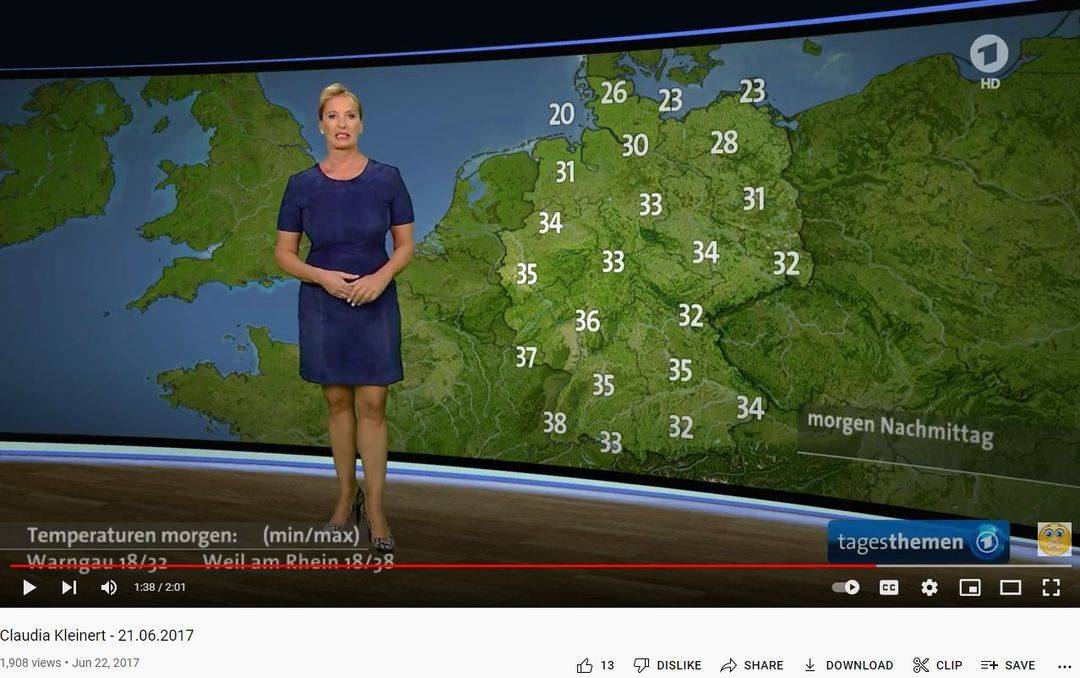 This screenshot taken August 2, 2022 shows a June 21, 2017 weather report from Tagesthemen posted on YouTube
The yellow and red map is also from Tagesthemen and was presented by Kleinert on June 20, 2022 — one day earlier than the date shown in the picture shared on social media.
In the video, Kleinert reports temperatures ranging from 20 to 25C in the north and 26 to 32C further south. The temperatures are lower than those shown on the green map from 2017.
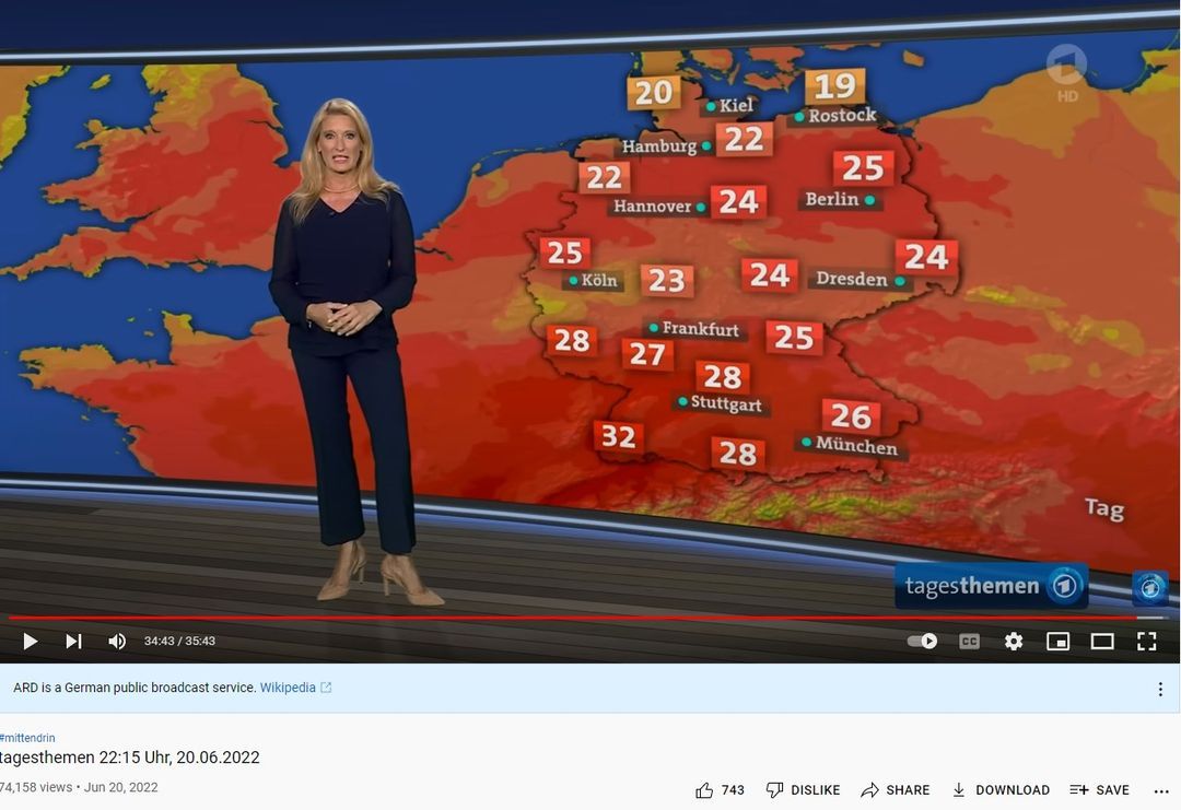 This screenshot taken August 2, 2022 shows a June 20, 2022 weather report from Tagesthemen posted on YouTube
The report later includes green maps, but they are focused on general forecasts and rainfall — not temperatures.
Different teams
The preparation of Tagesthemen weather forecasts has changed in recent years.
At the beginning of 2020, ARD launched a joint meteorological center for the network’s shows and programs, including Tagesthemen. The operation of this center, called ARD-Wetterkompetenzzentrum (ARD Weather Competence Center), was entrusted to the regional broadcaster HR (Hessischer Rundfunk).
HR spokesperson Sabine Renken said in a July 27, 2022 email that, until the end of 2019, weather forecasts for Tagesthemen were prepared externally.
She told AFP: “The supplied temperature maps in the Tagesthemen session showed the temperature exclusively in numbers,” with a green background regardless of temperature.
Renken said another ARD news program called Tagesschau also uses colors to show temperatures
In 2019, Tagesschau responded to accusations that it had manipulated its weather map to exaggerate the effects of climate change, arguing that “the coloring allows you to guess how high the temperatures will be, even where there is no number.”
‘Not a matter of alarmism’
HR told AFP on July 26 that when ARD’s Weather Competence Center took over forecasts in January 2020, the design and presentation were standardized for both the Tagesschau and Tagesthemen programs.
The Tagesschau maps had shown temperature with color in addition to numbers for more than 30 years, HR said on July 27.
“It is not a matter of alarmism, but of making the graphics as clear as possible so they can be grasped quickly,” the broadcaster said.
Tagesschau, which has also been the subject of misleading claims online, has two map formats to show weather: one that uses red shades and is focused only on temperature, and one that uses green and is a general forecast.
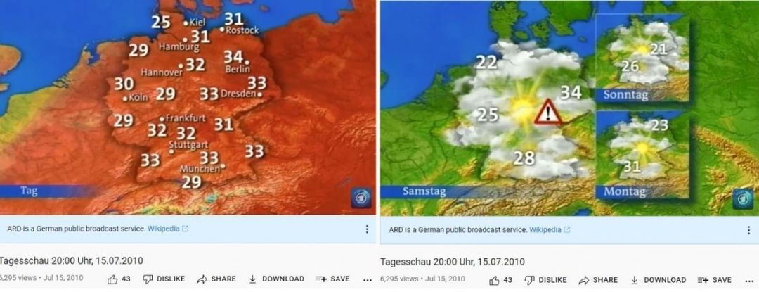 This screenshot from YouTube shows a July 15, 2010 Tagesschau broadcast
A broadcast from June 1999 shows a red map with temperatures between 25 and 30C. A broadcast in 2010 also shows the use of different maps.
Tagesthemen adopted a similar format in 2020, as evidenced by broadcasts from June to August. The program also used the red weather maps in summer 2021 broadcasts.
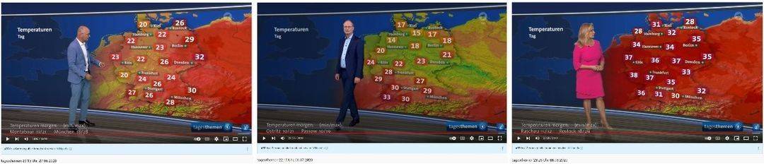 These screenshots taken July 27, 2022 show Tagesthemen weather maps published on YouTube in June (left), July (center) and August (right) 2020
Summers are getting hotter
Even if specific extreme weather events cannot be attributed to climate change, experts and scientists say a systematic change in the climate has been observed.
In fact, a comparison of temperature deviations over the past several decades shows Europe’s summers are getting hotter.
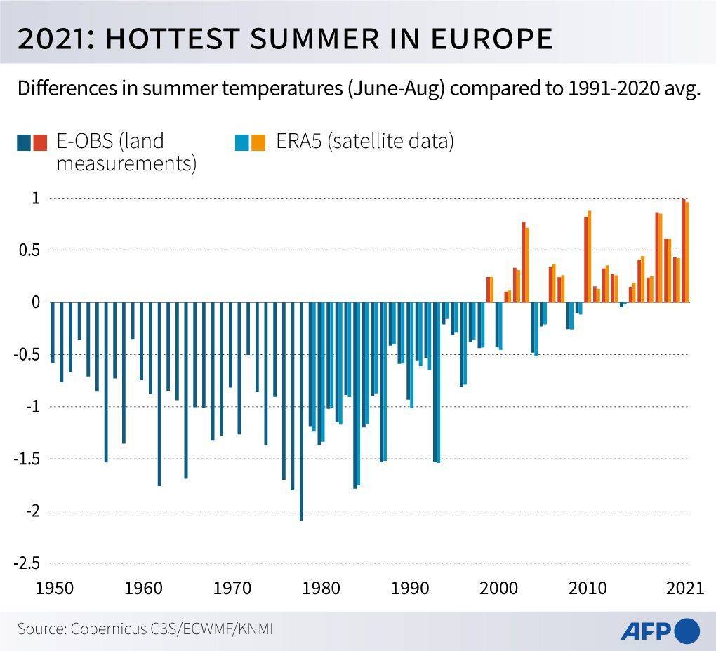 Differences in summer temperatures (June-August) in Europe from 1950 to 2021 compared to the 1991-2020 average
Meteorological institutes in Germany, Austria and Switzerland have confirmed this.
In a joint evaluation of the summer 2020 climate, the state institutes said “summer has become massively warmer in Switzerland, Germany and Austria since the 1990s” and that “what used to be an extremely hot summer is now an average summer.”
Experts say heatwaves like those that hit large parts of Europe in summer 2022, as well as the record-breaking hot spell in India and Pakistan in March 2022, are signs of climate change.
World Weather Attribution, a project involving scientists from several different countries, has published studies that show climate change makes heatwaves more likely to occur.
AFP has fact-checked other misleading claims about the climate here.