
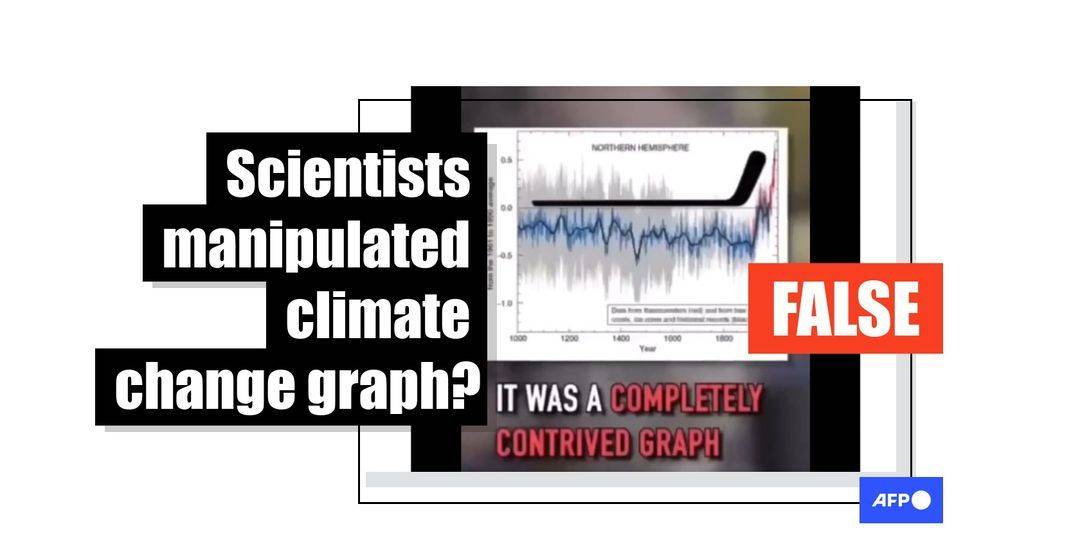
A speaker in a video viewed hundreds of thousands of times on social media claims scientists removed data from a graph to exaggerate global warming. This is false; the chart includes global data that make regional warming stand out less, and such periods do not disprove human-caused climate change.
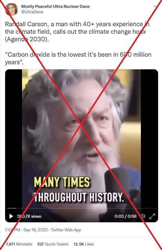
“Randall Carson, a man with 40+ years experience in the climate field, calls out the climate change hoax,” says a September 18, 2022 tweet. It links to a video that mentions a climate-change chart known as the “hockey stick”.
Climate skeptics have been attacking the “hockey stick” for years — but numerous subsequent studies replicated its findings and the US National Academy of Sciences endorsed it.
The post had been retweeted nearly 8,000 times as of October 7, 2022, and the video it shares had amassed more than 280,000 views. The clip was also posted on video sharing platforms YouTube, Rumble, Bitchute and Odysee.
 Screenshot of a tweet taken October 7, 2022
The speaker is Randall Carlson, who sells video workshops about “Sacred Geometry” online and releases podcasts about cosmography.
In the video, Carlson says temperatures were higher in the “Medieval warm period” than they are now, implying these past fluctuations disprove the fact that human-caused carbon emissions are driving global warming.
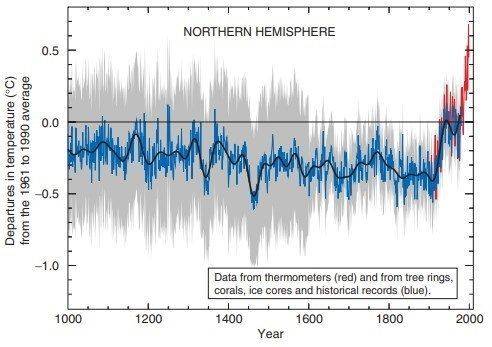
As evidence, he cites past reports from the Intergovernmental Panel on Climate Change (IPCC) and its “hockey stick” chart — a line graph that shows a sharp rise in temperatures since 1850, when carbon emissions started to rise due to the Industrial Revolution.
“The IPCC’s first report of 1992 showed that the Medieval warm period was warmer than the present,” Carlson says in the video. “Well, this didn’t fit the narrative, so by the time the 1996 report came out it was a completely contrived graph called the hockey stick.”
He claimed IPCC authors manipulated the graph and “flattened it out” by removing two stretches of temperature extremes — the Medieval warm period from around 800 to 1200 CE and the “Little Ice Age” from the 14th to the 19th century — to make the post-1850 rise look more unusual.
But the claim is false.
 The IPCC first included the “hockey stick” graph in its report in 2001
The long handle of the hockey stick stretching from the left appears relatively flat as the Medieval warm period, also known as the Medieval Climate Anomaly, and the Little Ice Age did not affect the whole globe at the same time. When peaks such as those in Europe and North America are combined with global data, they flatten out.
“We now know very well that these were to a great extent regional rather than global phenomenon, with very small changes at the global scale,” said Michael Mann, a professor of Earth and environmental science at the University of Pennsylvania, in an October 6, 2022 email.
On the other hand, the sharp rise in temperatures since 1850 — the “blade” of the hockey stick at the far right — has been recorded worldwide; it refers to global surface temperatures.
“Both the rate and magnitude of modern warming are unusual relative to the changes of the past 24,000 years,” according to a 2021 study in Nature, a peer-reviewed journal.
Graph from 1998
Mann was one of the original authors of the “hockey stick” climate curve in 1998, when it was featured in a study published in Nature. The chart, updated with longer-term data, then appeared in the IPCC’s flagship climate change report in 2001 — not 1996, as Carlson claimed in the video.
Carlson also said in the clip that “the IPCC’s first report of 1992 showed that the Medieval warm period was warmer than the present.”
But the IPCC’s first report came out in 1990; a supplement was added in 1992. And neither document contained temperature graphs going back further than 1850.
Temperature measurements from periods prior to the 19th century are calculated from “proxy” records such as tree rings, corals and ice cores.
Mann published a book in 2013 about climate skeptics’ campaign against the hockey stick.
CO2 in the atmosphere
At the start of the video, Carlson says: “The climate right now is no warmer than it’s been many times throughout history. Our baseline is now the lowest that carbon dioxide has been in 600 million years.”
The clip includes a graph apparently sourced from a blog about CO2 levels and mass extinctions. The claim implies greenhouse gases are not to blame for rising temperatures over the past 150 years.
Scientists, however, point to the speed of the post-industrial rise in CO2. NASA says the human-caused rise in CO2 is greater than what naturally happened at the end of the last ice age 20,000 years ago.
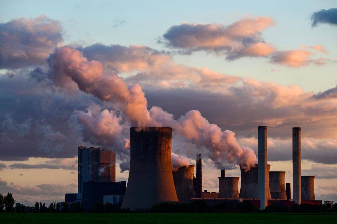 The lignite-fired Niederaussem power plant operated by German energy giant RWE near Niederaussem, western Germany
“The general statement that CO2 and global temperature have been higher before are both true. But to say that means current warming doesn’t matter is where the logic breaks down,” said Chris Jones, a research fellow in the Earth System and Mitigation Science Team at Britain’s Met Office, in an October 6 email. “It’s an age-old trick to present disinformation by starting with a fact and trying to seamlessly move into the falsehood.”
He added that “current warming is rapid and unprecedented during the time we’ve built our civilizations.”
The IPCC reviews studies to summarize how humans are driving climate change. The body publishes its findings in reports compiled by hundreds of scientists in dozens of countries.
“It is unequivocal that human influence has warmed the atmosphere, ocean and land,” the IPCC said in its 2021 report.
AFP has fact-checked other false and misleading claims about climate change here.
